Color as Conviction: How Hamptons Designers Are Using Bold Carpets to Define the New Minimalist Interior

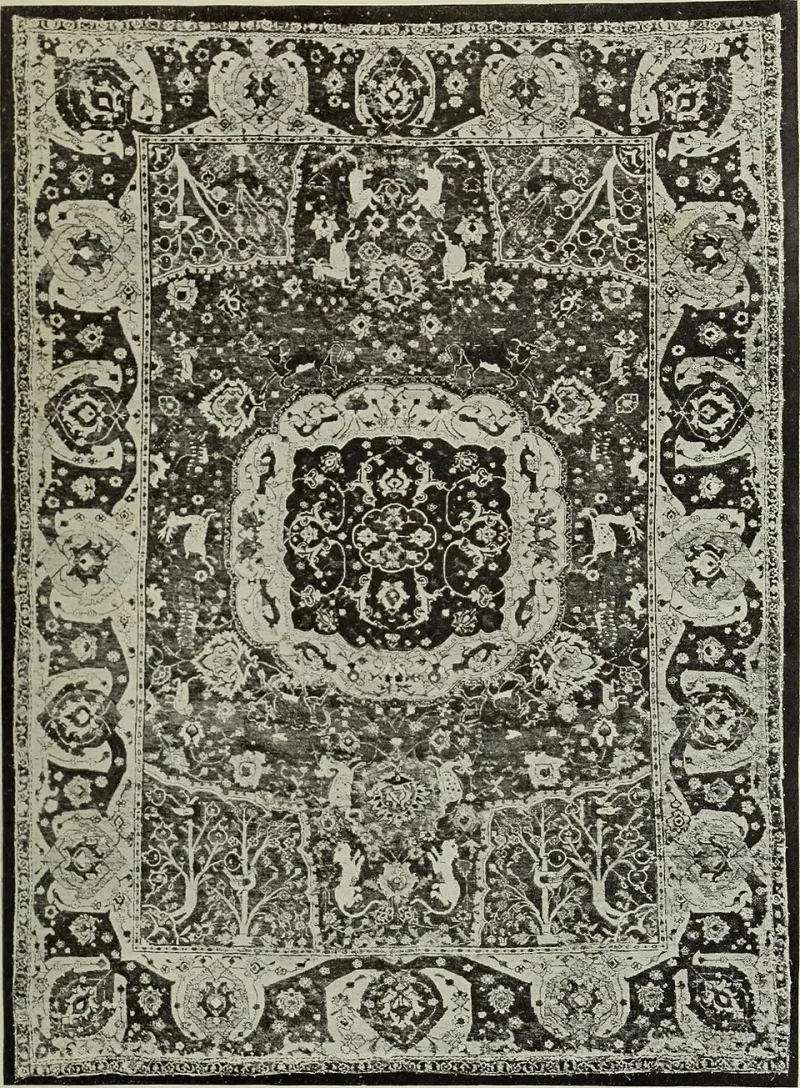
Photo: William Murphy, CC BY-SA 4.0, via Wikimedia Commons
There is a particular kind of courage required to lay a deep-toned, dramatically patterned carpet in a room that has otherwise been stripped to its architectural essentials. It is the courage of restraint applied selectively—the confidence to let a single element carry the full weight of a space's character. In the Hamptons, where the design conversation has long been shaped by an interplay between coastal ease and serious wealth, that courage is increasingly in evidence.
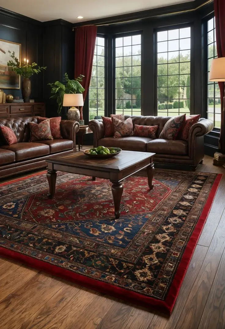
The neutral carpet, long the default choice of the cautious decorator, is not disappearing. But it is being joined—and in some of the most compelling recent interiors, supplanted—by pieces that make an unambiguous statement. Inky indigos. Warm terracottas informed by Moroccan tile traditions. Geometric patterns drawn from mid-century Scandinavian textiles. Botanical motifs scaled to the proportions of a double-height great room. These are not accidental choices. They are the product of a design philosophy that treats the floor as a primary surface rather than a neutral backdrop.
The Minimalist Paradox
To understand why bold carpets are thriving in minimalist spaces, it helps to understand what contemporary minimalism actually demands. The stripped-back interior—white walls, clean sightlines, furniture with architectural rather than decorative ambitions—does not create visual silence. It creates visual pressure. Every element that remains in such a space is subject to intense scrutiny, because there is nothing else to look at.
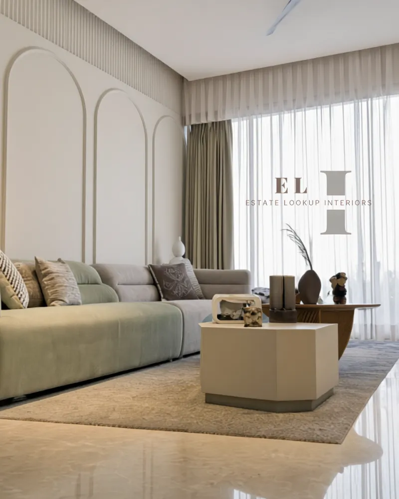
This is precisely why a thoughtfully chosen carpet succeeds where a neutral one can fail. In a room of poured concrete, bleached oak, and linen upholstery, a sand-colored carpet disappears into the background, contributing nothing. A carpet in a considered deep sage or a structured trellis pattern, by contrast, becomes the room's organizing principle—the element from which all other decisions radiate. It does not compete with the minimalism; it completes it.
Several Hamptons designers have articulated this logic explicitly in their recent project work. The argument, consistently, is that minimalism is not about absence. It is about precision. And a bold carpet, chosen with precision, is among the most powerful tools available.
Case Study: The Water Mill Renovation
A recent renovation of a mid-century property in Water Mill offered a compelling demonstration of this principle. The homeowners, a couple with a substantial collection of contemporary American art, had inherited a house with strong bones but a series of interiors that felt disconnected—each room decorated independently, without a coherent visual logic threading through the whole.
The lead designer's solution was to anchor each primary space with a carpet that functioned as a color key for the room's broader palette. In the living room, a large-format hand-tufted carpet in deep prussian blue—its surface texture subtly varied to catch the shifting light from north-facing windows—was chosen first, and every subsequent decision made in dialogue with it. The upholstery took its warm cream tone from the carpet's secondary color. The bronze of the side tables echoed a thin geometric border woven into the pile. The room arrived at a sense of unity that had previously eluded it, and the carpet was the instrument of that unity.
In the adjacent study, a smaller piece in a burnt amber with an abstracted vine motif provided a warmer counterpoint—a room that felt deliberately different from the one beside it, but related, as if the two spaces were chapters in the same narrative.
Pattern as Architecture
For spaces with strong architectural character—vaulted ceilings, exposed beams, walls of glass that frame ocean views—pattern in a carpet can serve a structural rather than merely decorative function. A large-scale geometric, for instance, can impose order on a room that might otherwise feel formless, its repetition providing the visual rhythm that architecture alone does not supply.
In a recently completed East Hampton residence with a great room that spans nearly forty feet, the designer chose a custom carpet featuring an oversized diamond lattice in two tones of warm gray. The pattern's scale was calibrated specifically to the room's proportions—a decision made only after the designer had spent time in the space at different hours of the day, observing how the light moved and where the eye naturally traveled. The result is a floor that reads as a design element in its own right, visible from the mezzanine above and from the terraced exterior, contributing to the room's visual coherence from multiple vantage points.
This kind of scaled thinking—treating the carpet as an architectural surface rather than a furnishing accessory—is increasingly characteristic of the most sophisticated Hamptons interiors.
The Role of Texture in the Color Conversation
Color and pattern do not operate in isolation. Texture is the third variable in this equation, and in many ways the most nuanced. A deep jewel-toned carpet in a cut pile will read very differently from the same color rendered in a looped or bouclé construction. The former absorbs light, creating depth and intimacy. The latter reflects it, lending the color an almost mineral quality that suits more architecturally spare environments.
Hamptons designers are increasingly specific about this interplay. The request is no longer simply for a blue carpet or a patterned carpet; it is for a particular quality of surface that will interact with a specific light condition in a defined way. This level of specification requires a supplier capable of working at a corresponding level of detail—one who understands not just what is available, but what is possible.
Timelessness Without Timidity
The most persistent objection to bold carpet choices in luxury interiors is the fear of impermanence—that a strong color or pattern will feel dated in five years, requiring a costly replacement. This concern, while understandable, tends to reflect a conflation of boldness with trendiness.
A carpet in a well-considered deep teal or a classically structured geometric is not a trend piece. It is a position. The colors that have animated the finest interiors for centuries—the indigos of Flemish interiors, the terracottas of Italian villas, the lacquered reds of Chinoiserie rooms—are bold. They are also timeless, because they were chosen with conviction rather than caution. The carpet that is most likely to feel dated is, paradoxically, the one chosen for its inoffensiveness: the beige that committed to nothing and therefore ages into nothing.
At Hamptons Carpet & Co., our design consultations proceed from the assumption that the most enduring interiors are those in which every element was chosen with intention. The floor is no exception. We invite clients to consider what it might mean to step into a room and feel, immediately and unmistakably, that they are somewhere specific—a room with a point of view, a character, a color that declares itself without apology.
That declaration, made underfoot, is among the most lasting a home can offer.